The original version of this article was published in Spanish. This English translation is provided for convenience only. In the event of any discrepancy, the Spanish version shall prevail.
In line with its growth and consolidation within the financial market, Mills Capital presented a new identity that puts front and center the values that define its way of doing business: personalized attention, technical expertise applied to advisory services, and a deep commitment to each client, with honesty as a cross-cutting principle, in a landscape where technology expands access to information, financial structures grow more complex, and brands must keep pace with clear, coherent identities aligned with how they work.
"The capital market is constantly evolving, and it challenges us to continually rethink how we approach our brand and how we connect with our audiences. Keeping pace with that dynamism required a strategic decision that shaped both our identity and the way we communicate and advise," said Emilia Di Rocco, Marketing Manager at Mills Capital.
The new identity also reflects the holding's growth and the consolidation of its various business units, providing a visual and conceptual system that organizes, integrates and reinforces a shared way of thinking about relationships with clients, teams and strategic partners.
The brand renewal began with trust, understood as a process built over time through consistency between what is said and what is done. "Trust means honoring your word and your actions toward the other person, and responding in kind. When that happens, bonds grow stronger and relationships flow. That was the conceptual foundation of the brand work," explained Hernán Berdichevsky, founder and director of Brandformance, the agency responsible for the redesign.
The elements that define the new identity
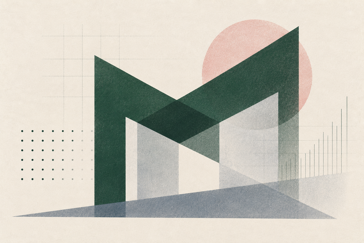
The symbol was built from the initial "M," rendered with sharp, precise angular lines that convey solidity, structure and professionalism. Its shape suggests two people meeting and shaking hands, a representation of the close bond between Mills Capital and its clients.
The combination of a firm symbol and a refined typeface expresses the duality that defines the company: rigorous financial strategy paired with personalized attention.
The typeface used for the name "Mills Capital" conveys elegance and credibility, while the dark green color reinforces a sense of stability, intelligence and strength. Its deep, contemporary tone sets Mills Capital apart in the market, projecting trust without losing warmth.
The visual system is built around a monogram formed by dots that make up the brand's "M." Each dot represents a stage in the work process, and together the system expresses the balance between structure and humanity, reflecting the essence of the company: connecting capabilities, ideas and people to develop tailored, clear and strategic solutions.
"The Mills Capital symbol doesn't just identify the organization — it represents a community of professionals who work with rigor, vision and humanity: people who build value together. This work reflects the way we operate: listening, understanding each need, and providing concrete solutions grounded in expertise and trust," concluded Emilia Di Rocco, Marketing Manager at Mills Capital.